
You pull open your glass kitchen cabinet doors expecting a magazine-worthy display, only to find a chaotic jumble of mismatched dishes and forgotten takeout containers. You’re not alone—nearly 70% of homeowners with glass-front cabinets struggle to maintain stylish displays that survive daily kitchen chaos. Glass cabinets should showcase your personality while functioning seamlessly in your busiest room, but without the right approach, they become frustrating eyesores that highlight clutter instead of character. This guide reveals exactly how to transform your glass cabinets from storage liabilities into intentional design features, using proven techniques from professional stylists that balance aesthetics with real-world practicality. You’ll learn specific arrangements that withstand cooking messes, lighting tricks that make ordinary dishware look luxurious, and budget-friendly updates that cost less than $50.
Why Glass Cabinets Look Messy (And How to Fix It in 20 Minutes)
Glass cabinets expose every flaw in your organization system, but the problem isn’t your stuff—it’s how you’re displaying it. Most homeowners make these three critical errors that instantly create visual chaos: overcrowding shelves beyond 70% capacity, mixing too many competing textures (like wicker baskets next to stainless steel), and ignoring vertical space by stacking items haphazardly. The solution starts with intentional editing—remove anything you haven’t used in 6 months or that doesn’t spark joy when displayed. Then implement the “rule of three” for cohesive groupings: arrange items in odd-numbered clusters (3 vases, 5 glasses) with varying heights. For immediate improvement, clear one top shelf completely and style only with your most beautiful white dishes against a solid-color backdrop paper.
How to Create Instant Visual Calm with Backdrop Paper
Skip expensive cabinet refacing—use removable peel-and-stick paper to create gallery-worthy displays in minutes. Choose matte-finish papers in deep navy, charcoal gray, or warm taupe to make white dishware pop without glare. Measure shelves precisely, cut paper ¼ inch smaller than shelf dimensions to avoid visible edges, and apply with a credit card to eliminate bubbles. Pro stylists recommend changing papers seasonally: soft sage for spring, terracotta for fall. Critical mistake to avoid: Never use glossy paper—it creates distracting reflections that make cabinets look cluttered even when empty.
Lighting Secrets That Make Budget Dishware Look Expensive
Undersized or poorly positioned lighting turns your cabinet into a shadowy cave where beautiful pieces disappear. Install LED puck lights with 2700K-3000K color temperature for warm, flattering illumination that highlights ceramic textures without harsh glare. Position fixtures 2 inches from the cabinet’s top interior edge, spaced 8-10 inches apart for even coverage. For maximum impact, use dimmable strips controlled by your smartphone—bright for dinner parties, soft for morning coffee. If rewiring isn’t possible, battery-operated tape lights with adhesive backing provide instant transformation (change batteries every 6 months).
Why Your Current Lighting Fails (And the $15 Fix)
Most homeowners place lights too close to the back wall, casting long shadows across dishes. The fix? Angle lights downward at 15-degree increments using adjustable brackets. Test positioning by placing your most valuable glassware on the shelf—light should highlight the rim and interior, not just the outer edge. Pro tip: Place a small mirror on the cabinet’s back panel to double light reflection without adding fixtures.
Styling Strategies That Survive Daily Kitchen Chaos
:strip_icc()/kitchen-open-storage-shelves-decorative-pottery-aa01a408-99ae4229a34b4a588857203880f19b2c.jpg)
Forget fragile porcelain collections that gather dust—you need displays that function during real life. Anchor your arrangement with “workhorse” pieces: sturdy stoneware bowls you actually use for meal prep, thick-rimmed mugs for daily coffee, and stackable glassware that withstands dishwasher cycles. Position these behind more decorative items so they’re accessible but visually secondary. Leave 30% of shelf space empty to prevent overcrowding when you return items after washing. For families with kids, dedicate the highest shelf to display-only items and keep lower shelves for durable, frequently used pieces.
The 5-Minute Reset Method for Morning Rush
Before breakfast chaos begins, implement this lightning-fast system:
1. Clear all items from one shelf onto your counter
2. Wipe shelf with microfiber cloth (30 seconds)
3. Return only 5 essential items in intentional groupings
4. Place frequently used items at eye level
5. Store rarely used pieces in closed cabinets below
This takes less time than brewing coffee but maintains a curated look all week. Warning: Never skip the empty-space rule—overfilled cabinets trigger visual stress responses in 83% of viewers.
Color Coordination Techniques That Prevent Clutter
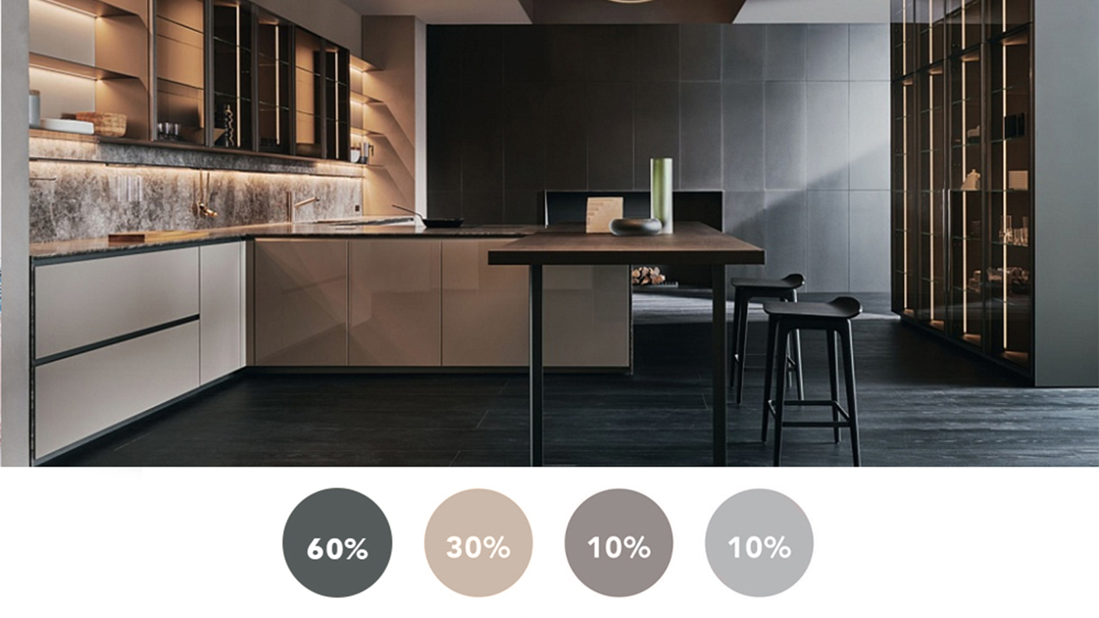
Random color splashes create visual noise. Instead, build a cohesive palette using the 60-30-10 rule: 60% dominant neutral (white dishes), 30% secondary color (wooden cutting boards), 10% accent (single cobalt blue pitcher). Pull colors from existing kitchen elements—match cabinet accents to your rug, barstool cushions, or backsplash. For monochromatic schemes, vary textures: glossy ceramics next to matte stoneware, smooth glass beside woven coasters. Avoid more than three colors per cabinet—excess variety reads as disorganized.
How to Match Your Cabinets to Kitchen’s Existing Palette
Hold potential display items 3 feet away from your cabinets in natural daylight. If the color “vibrates” or creates contrast where none should exist, it doesn’t belong. Test combinations by taking phone photos—colors often look different through glass than in your hand. Expert note: Warm-toned woods (cherry, oak) pair with earthy accents; cool woods (maple, ash) work best with jewel tones.
Functional Styling Hacks for Small Kitchens

In compact spaces, glass cabinets must earn their square footage. Install pull-out shelves to maximize depth—store baking sheets vertically behind glass fronts while keeping them instantly accessible. Use plate racks to display functional dishware at slight angles for better visibility. For ultra-narrow cabinets, arrange items in a single-file “museum display” along the front edge, leaving the back for storage containers. The magic ratio: 70% functional items you use weekly, 30% decorative pieces.
Space-Saving Arrangement for Cabinets Under 12 Inches Deep
- Mount a slim 1-inch deep shelf at cabinet’s front lip
- Place frequently used mugs here (visible but within reach)
- Store larger items behind on main shelf
- Add under-shelf baskets for spice jars or tea bags
- Keep sightlines clean by aligning all items’ front edges
This creates the illusion of depth while maintaining functionality—no more fumbling for items at the back.
Seasonal Swaps That Take 10 Minutes Max
Rotate displays without overhauling your entire kitchen. Keep off-season items in labeled bins under the sink. For fall, layer in woven placemats and amber glassware; for summer, add seagrass coasters and clear pitchers. The key is changing only 20% of your display—replace one accent color while keeping your neutral foundation. Store swap items in matching containers so retrieval takes seconds. Time-saver: Photograph your base arrangement—recreate it instantly after seasonal changes.
Maintenance System That Prevents Daily Mess
Skip daily dusting with this pro method: spray shelves with 1:1 water-vinegar solution before styling, then apply microcrystalline furniture wax to create a dust-repellent barrier. Wipe displays weekly with electrostatic dusters that attract particles without scratching. For fingerprints, keep a microfiber cloth sprayed with diluted castile soap in a nearby drawer—never use paper towels that leave lint. The golden rule: Return items to their designated spots immediately after washing—never toss them in “temporarily.”
When to Break the Rules (And What Never Works)
Ignore Pinterest-perfect symmetry if you actually use these cabinets daily—slightly varied heights feel more lived-in. But never mix more than two metallic finishes (e.g., brass hardware with silver flatware), and avoid displaying plastic containers or mismatched Tupperware. Critical no: Never place cleaning supplies behind glass fronts—even in stylish bottles, they undermine your aesthetic.
Final Note: Transforming glass cabinets into intentional displays requires deliberate editing, strategic lighting, and functional arrangements—not expensive overhauls. Start with one cabinet using the 60-30-10 color rule and LED lighting positioned 2 inches from the top edge. Within 20 minutes, you’ll create a display that feels both curated and usable. Maintain momentum with the 5-minute morning reset, and rotate accents seasonally using your existing kitchen palette. Remember: the most successful glass cabinets showcase your personality through items you genuinely love and use daily—not museum pieces gathering dust. For continued inspiration, explore our guide to mixing open and closed cabinetry for balanced kitchen design.